
I just ran across this project by Hella Jongerius on Designboom and I’m kind curious what others think about this color theory/glaze project.
Here’s a bit of the write up (more at Designboom)
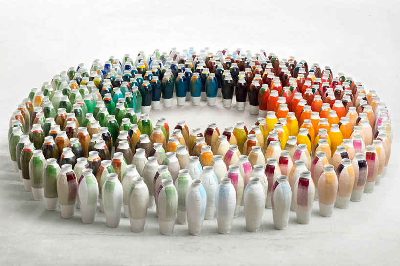
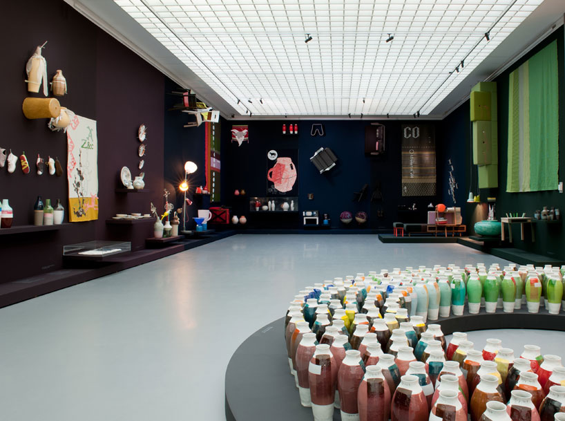
“entitled ‘300 coloured vases’, the installation consists of three series of coloured vases in which the designer has experimented in colour, using the vessels as her ‘canvas’. the first two series are a collection of forty and forty-two vases respectively, each partially coated with paint from the industrial color ranges RAL (2003) and NCS (2007).
the third series has been produced in collaboration with glaze experts at royal tichelaar makkum.
whereas the first two series employ industrial paints, the third series uses a combination of
a hundred historical mineral recipes and a hundred modern chemical glaze recipes, which jongerius refers to as the ‘fast-food’ colours of the modern ceramics industry. these recipes include such ingredients as cadmium (red), iron (brown), selenium (yellow), copper (green), cobalt (blue) and manganese (purple). the glazes are applied to the vases in layers of patterns, which results in an optical blending – something like a pointillist style on porcelain.
these experimental combinations of colours and patterns and alteration in firing temperature results in new colours, which unlike industrial colours that appear flat, have an irregular, layered appearance.”


I'd love to see this in person so compare the 'old' glazes versus the new. I know when I've seen the ancient glazes in museums I'm always amazed at their richness.
j
Yeah I wondered if this is a work that really needs to be seen in person to be appreciated. The whole presentation seems visually stunning, but also an esoteric conceptualization of my memories of triaxial blends.
I think I need to do some more reading about the project…
It definitely got me thinking though : )
I love the concept. When I was in design school, I had a color theory class and we had to paint little square tiles and mount them on a board to represent the gradation of colors from their lightest to darkest values and hues. It took forever but when it was completed it looked like a piece of art. I can't imagine the work that went into getting all of the glazes together. Would love to see it in person